INTERVIEW WITH KARMAZID
02/19/21 | J.R.
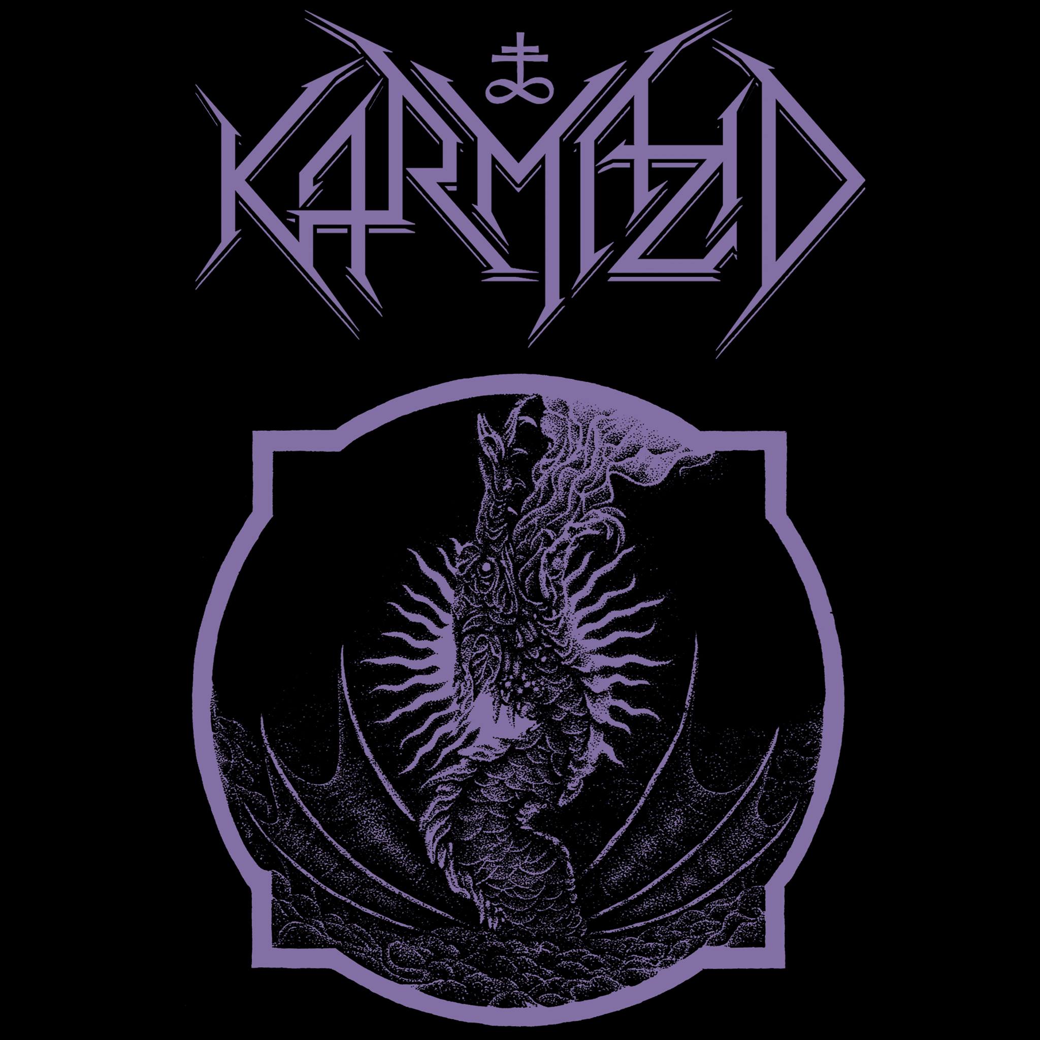
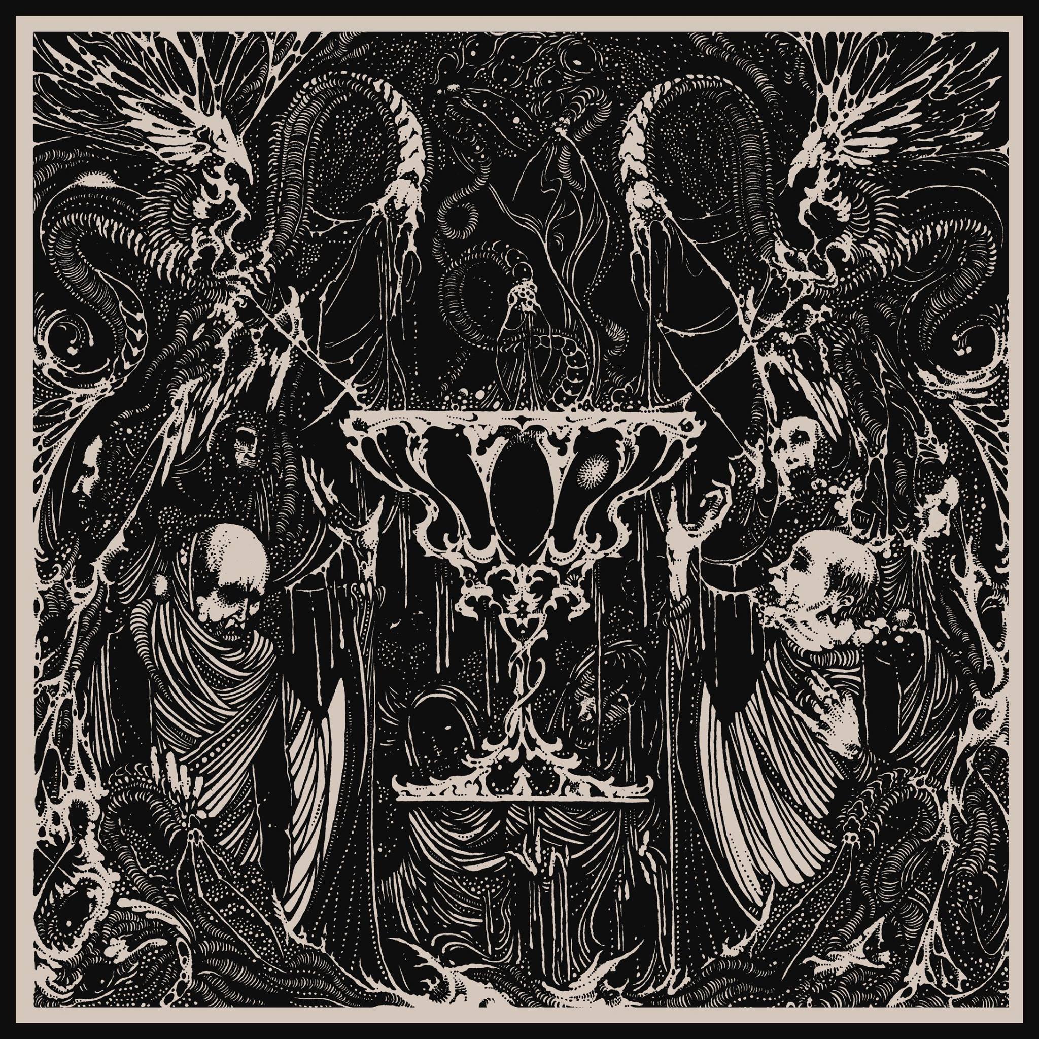
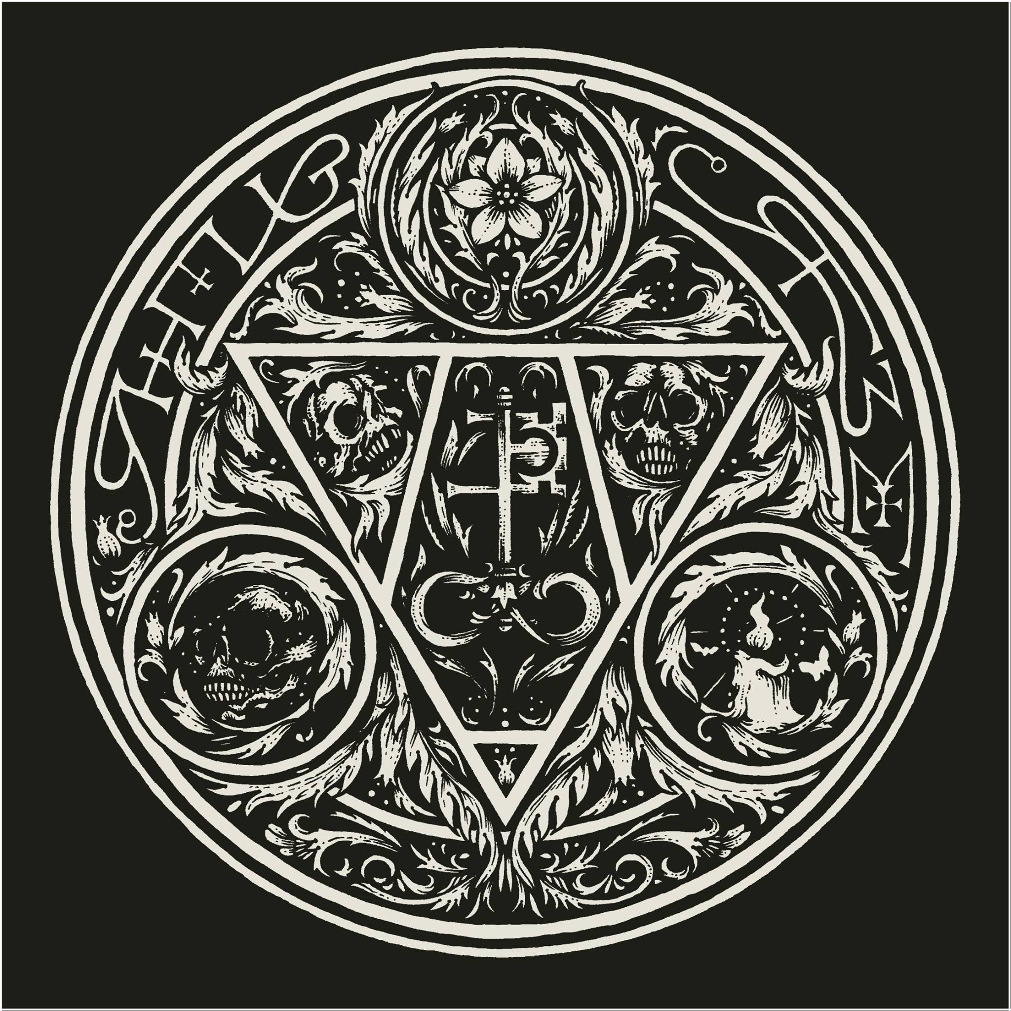
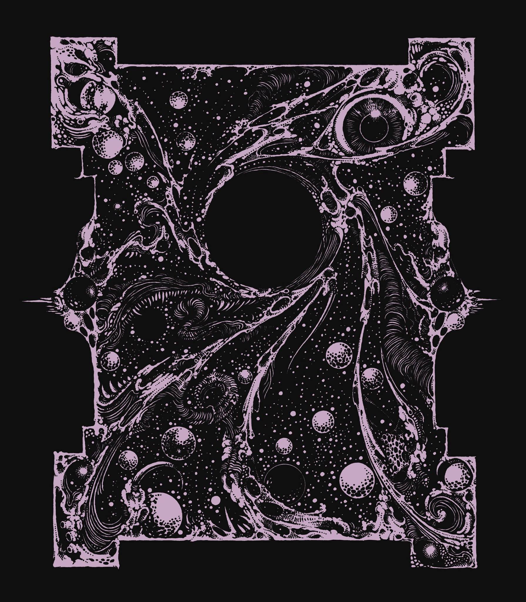
Over the past few years, artist Karmazid’s “cancerous and satanic translation of classic 19th century illustrations” has become ubiquitous within the burgeoning black and death metal underground. From logos to full, LP-sized cover art, Karmazid’s uniquely dark, near-Clarke-ian illustration style lends itself to the darkest ends of the musical spectrum. While many have used Karmazid's artwork, his style remains resolute; having discovered his own approach by chance, Karmazid's steady hand can be seen in the Tchornobog logo and Urfaust release covers alike. In a rare interview, Karmazid offers his thoughts on his own work, the creative process, as well as a list and a breakdown of his favorite metal logos from other artists through the years.
When did you decide to pursue artwork professionally? That is to say, when did your sketches turn from personal projects to something you did for other artists?
So, weirdly enough there wasn’t really an all-too-long phase of me just doing it for myself. Right around my 30th birthday I traded some bad habits against sitting my ass down and picking up pens again, something I hadn’t done since I was way younger. On top of being new-ish to drawing I was also new to social media but for some reason I had Instagram anyways. And because I wasn’t really interested in showing my face or lunch there, I uploaded some of my doodles. Not too much later, Jim [Dokter, of Urfaust] somehow stumbled upon that, looking back definitely, crap. He then commissioned me for one of his other projects and shortly thereafter for Urfaust which blew my mind and thinking back still does.
But yeah, from starting to draw until I had my first ‘job’ maybe 6 months or so passed. Which honestly might sound like a brag but it’s truly not, it's still as inexplicable and weird to me now as it was back then.
Did you ever consider yourself an artist before being discovered like that?
Not really and I still struggle with that word a bit, but that's more thanks to a weird, warped perception of what an ‘artist’ is. All my close friends and my wife are artists but for a while I thought that label was a bit of a confession of some sort of weakness. Which it definitely is, but I'm less shy now to admit that.
So no, I did not before and I only came around to accepting that label, as dumb as it sounds, not too long ago.
What did you consider yourself if not an artist?
I always thought ‘illustrator’ sounded cool and working class-like. Still, it’s only black ink and paper I’m using; when I think of an artist I think of...MORE, I guess. More material, more color, more ‘studies’ and stuff.
Are there any artists who inspired or continue to inspire you?
Yeah, both old and new. I don’t wanna forget one of the new ones so I'll just list the older ones I always bring up: Harry Clarke, Aubrey Beardsley, Alberto Martini, Frank Pape, Henry J. Ford, Chumbley, AOS, Leonora Carrington, Ian Miller, Mike Mignola and also Giger and the visions of David Cronenberg for example.
We see a variety of styles and genres of art cited in that list, but how would you classify Karmazid art?
A cancerous and satanic translation of classic 19th century illustration. I guess.
What makes you unsure?
Not wanting to sound pretentious [laughs].
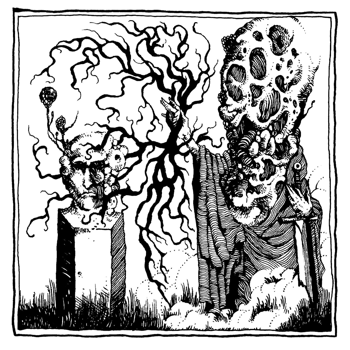
It’s art, I think everyone is allowed to act or sound pretentious sometimes.
I’m a big fan of theatrics and pathos and all that shit, it’s just that I see the line of good taste being crossed daily and I’m kinda trying not to, you know.
Do you have a favorite creation or creations?
I go through the traditional stages of postnatal depression in that I don’t want to see that stuff for a long while after I’m done with it and then some months later I see it being posted and I think, ‘yeah that’s kinda ok in a way.’
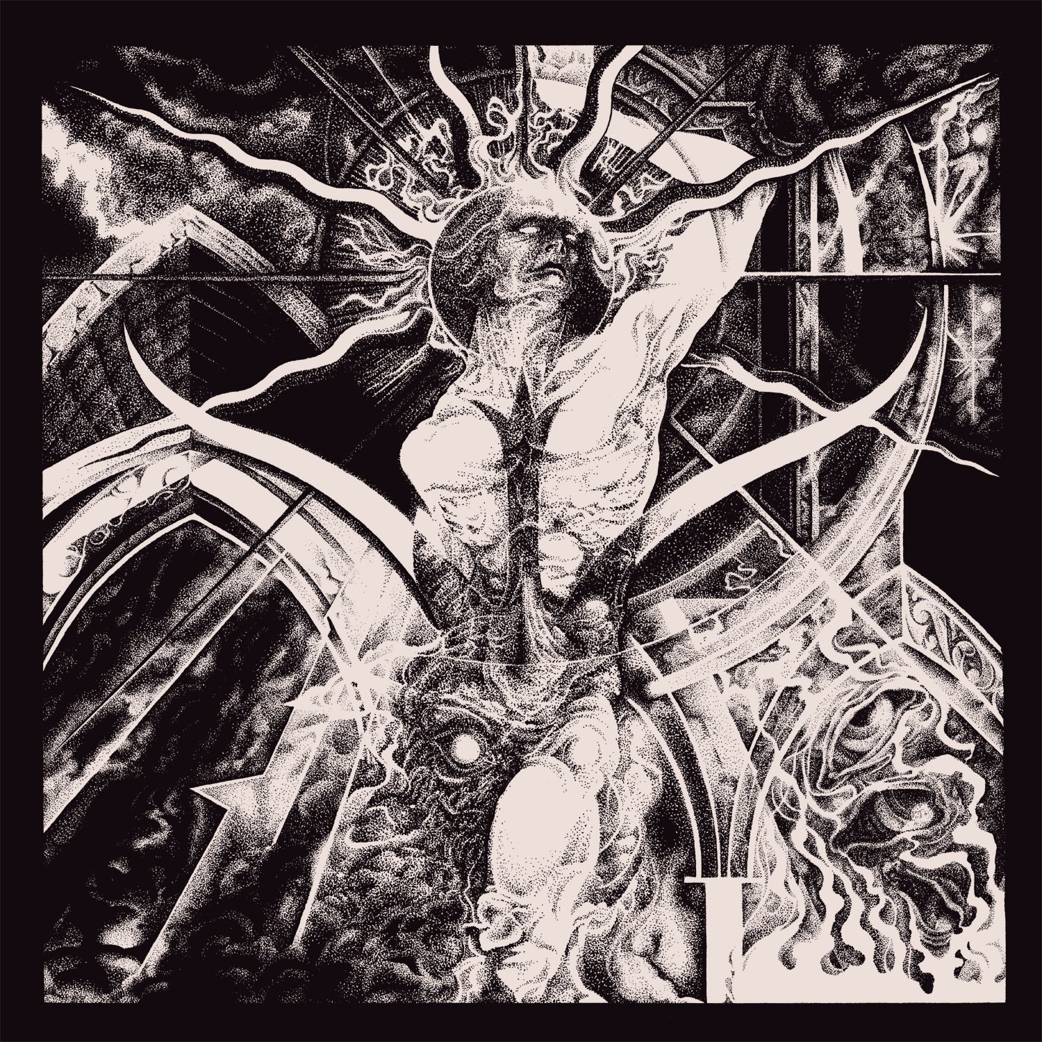
But looking back, I like my annual Abrasax illustrations, the one called ‘A Promethean Dream’ has some meaning to me. The ones I like the most are the free-form semi-automatic drawings I sometimes do, they're chaotic but full of stuff that is important to me. A lot of those I don't even show on social media.
What ideas or philosophies inspire your art?
A bunch of stuff, there for sure is a portion of Schopenhauerian pessimism, taking his famous quote to the extreme and exploring a world that is just this bit worse than this.
A lot of my themes revolve around perceived weakness, the dissolution of the matter that grows like a cancer around the soul or a spiritual ideal.
Devil worship, elements of vanitas and memento mori imagery play a role as well as more profane stuff like classic Sword & Sorcery/Sci-Fi/Cosmic Horror stuff.
Your art is obviously dark, but the idea of your work being a part of a “worse”and more pessimistic world is interesting. Was it initially your goal to create this alternate universe within your art?
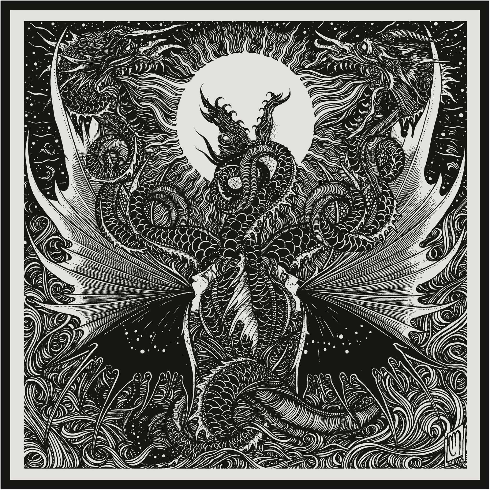
It always depends on what the definition of dark is. I find facing some things is often more a relief than anything else. The room I draw and spend most of my time in has black walls and is full of death and bones and skulls and shit but neither my wife, my friends, nor my cats ever felt uncomfortable in there; it’s kinda soothing. So it’s more a reflection of the way I feel about a lot of things, a certain amount of disgust for the profane and worldly.
So creating this type of art is more of a comfort than a confrontation for you?
I think so, but often a certain brand of comfort comes after a confrontation with something strange or unusual so there might be a bit of both in there.
After depicting death in so many ways, what are your thoughts on it?
I’m not really afraid of mine, to be honest, but like most of us I’m not really looking forward to seeing my loved ones go. I do believe that it’s not the end, though, but who knows.
To close, I thought it would be interesting to get an artist’s view on some metal logos. Do you have any favorites?
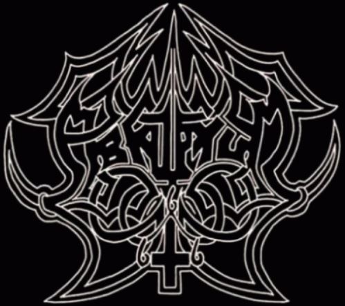
Abruptum: This one just owns, it has the symmetry but kinda not really, it works filled and with outlines only, it’s almost readable and just looks fucking evil.
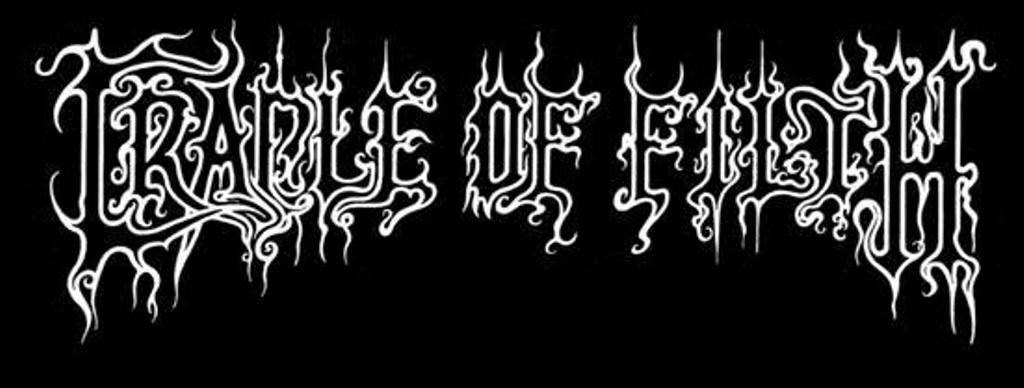
Cradle Of Filth: It’s pretty, dark, romantic, and iconic, not much to say but it’s the gold standard of simple-ish yet immediately recognizable.
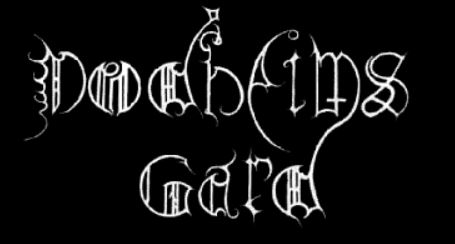
Dodheimsgard: Does everything so wrong that it’s just right, like a forbidden old alphabet, ominous and threatening.
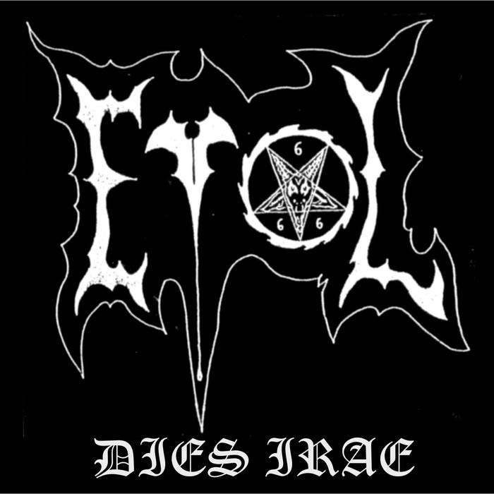
Evol: The dimensions are kinda fucked and I love it. Making a 4-letter logo so striking and cool is amazing.
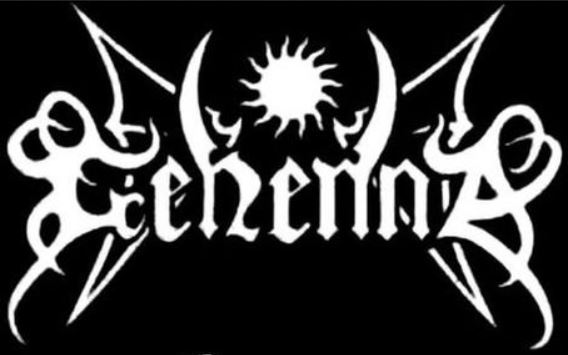
Gehenna: I love Gehenna and I love the logo, it’s simple, the first and last letter are weird and over the top, also it’s only one of two logos with wings in the list.
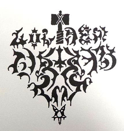
Golden Dawn: Just look at it. The Manowar hammer, the fucking weird letters, it has everything. The music is also amazing.
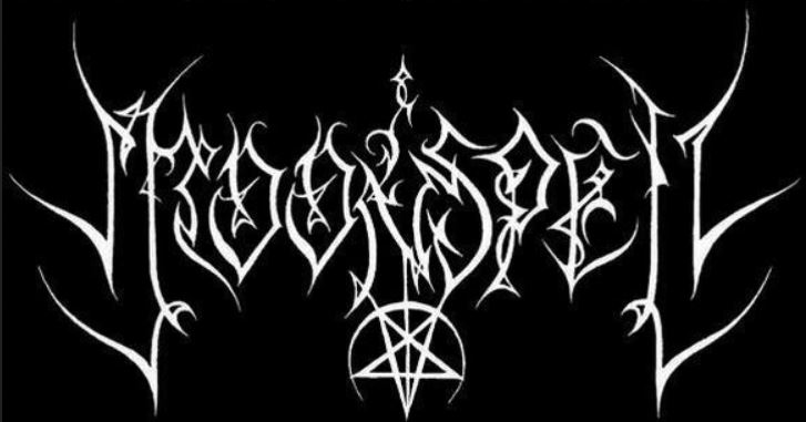
Moonspell: One of my fave logos in that style with the spaced letters and the almost-forced symmetry, it’s insanely aesthetic and evil.
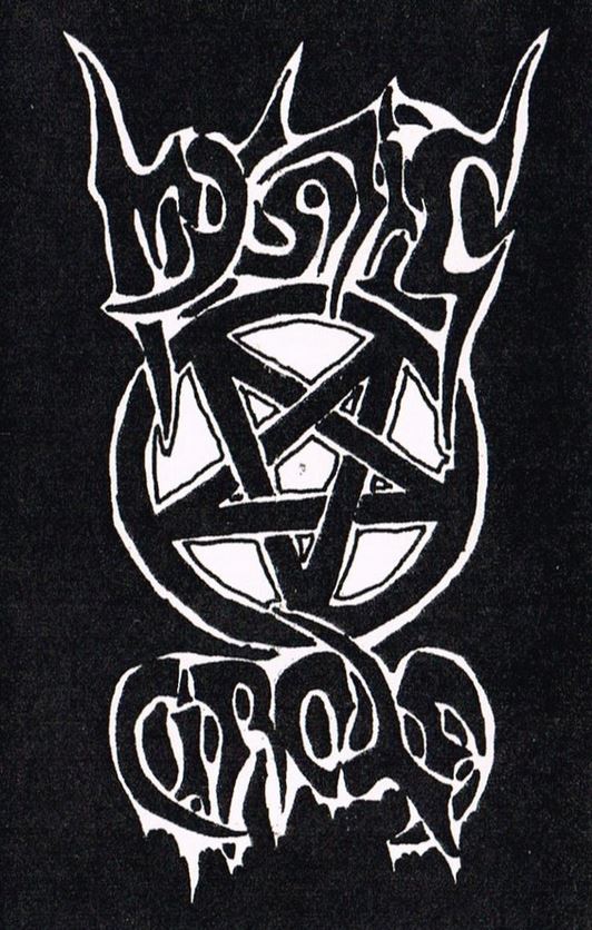
Mystic Circle: The band does nothing for me but I love the weird handful of almost Roger Dean-like metal logos like Venom and Morbid Saint. Also a giant pentagram.
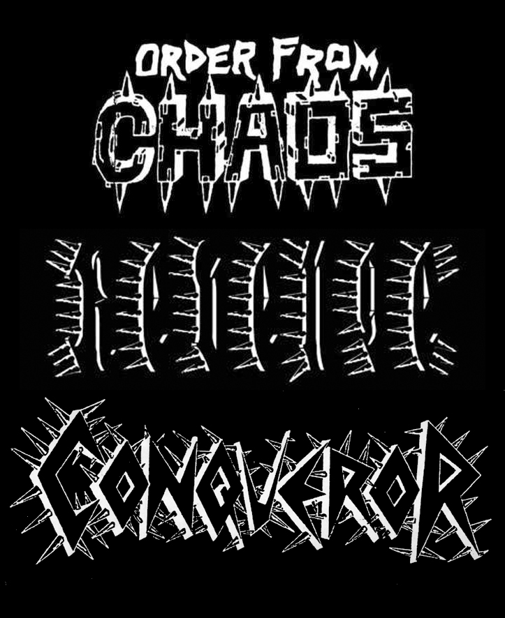
Revenge/Order From Chaos/Conqueror: Just so bold and over the top, the Revenge logo especially almost exclusively lives by the shading on the spikes. The OFC one has the bonus of almost looking like they took the first draft and I wish more logos were like that, it’s primal and savage.
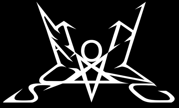
Summoning: I like that it just barely works and I’m not entirely sure it actually does to be honest. But I have a million shirts and CDs and records and tapes and pins and patches with that thing on it so there must be something about it.
Honorable mentions: Darkthrone, Moonblood, Dimmu Borgir (old), Profanatica, Enslaved (old).


